Hello PHC.
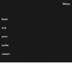
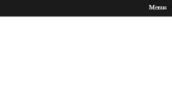
After sa long graveyard of work, I would like to show you today how to create responsive menus without any javascript. By the end of this post, you should have this output below:


With that said, let us start with a simple markup shown below:

Still, I will use SCSS for easy markup and avoid confusion how the layout works. This time, let us work with mobile first approach!
The mobile-first approach is exactly as it sounds: designing for the smallest screen and working your way up. It is one of the best strategies to create either a responsive or adaptive design.
If you find this tutorial overwhelming for starters, you may bookmark this post instead, and check this out later. If you are ready, let us style our navigation on a mobile device first:
Output:

For starters, you may be wondering why we have input and a label element. Let us used them as controls for our dropdown menu in a mobile device, see the markup below:
What will happen here is, if you click on label, the input tag will be checked, for example:

This way, we can then toggle the checkbox input by clicking the label menu. Please note, this will work if you have id set for your checkbox and a for an attribute in your label targetting the checkbox id:
<input type="checkbox" id="mobile-menu">
<label for="mobile-menu">Menus</label>
Amazing diba? Yes, I know how it feels. Now, let us hide the checkbox input, then move the label tag to the far right.
Output:

Of course, set the color to white, for both a tag and label tag.
Output:

WOW magic!
Of course, for a tags, this should be hidden, and only the "Menus" should be visible sa screen. At this point, you should have these rules below:
Output:

Our label "Menus" is not functional at the moment, and to go about this, let us create a CSS rule when a checkbox input is checked? then show a tags inside the nav element.
Output:

Promising diba? All in all, we should have this rules below:
Di maging responsive if we do not have any media queries.
What are media queries?
The @media rule is used in media queries to apply different styles for different media types/devices.
Simply, we will remove the CSS rules we place on our mobile layout, then replace with your desktop layout, after the minimum width of your browser to 600px.
Output:
Before 600px width of your browser.

After 600px widthof your browser.

If you wish to see these in action, please see
You do not have permission to view the full content of this post. Log in or register now.
I hope this will help starters in some ways. More powers for future Web Devs.
After sa long graveyard of work, I would like to show you today how to create responsive menus without any javascript. By the end of this post, you should have this output below:


With that said, let us start with a simple markup shown below:
HTML:
<input type="checkbox" id="mobile-menu">
<label for="mobile-menu">Menus</label>

<nav>
      <a href="#">home</a>
      <a href="#">tech</a>
      <a href="#">news</a>
      <a href="#">media</a>
      <a href="#">contact</a>
</nav>
Still, I will use SCSS for easy markup and avoid confusion how the layout works. This time, let us work with mobile first approach!
The mobile-first approach is exactly as it sounds: designing for the smallest screen and working your way up. It is one of the best strategies to create either a responsive or adaptive design.
If you find this tutorial overwhelming for starters, you may bookmark this post instead, and check this out later. If you are ready, let us style our navigation on a mobile device first:
Code:
nav{
  background-color: rgba(0,0,0,0.9);
  padding: 1.5rem 0rem;

  a{
    padding: 1rem;
  }
}
For starters, you may be wondering why we have input and a label element. Let us used them as controls for our dropdown menu in a mobile device, see the markup below:
HTML:
<input type="checkbox" id="mobile-menu">
<label for="mobile-menu">Menus</label>
This way, we can then toggle the checkbox input by clicking the label menu. Please note, this will work if you have id set for your checkbox and a for an attribute in your label targetting the checkbox id:
<input type="checkbox" id="mobile-menu">
<label for="mobile-menu">Menus</label>
Amazing diba? Yes, I know how it feels. Now, let us hide the checkbox input, then move the label tag to the far right.
Code:
#mobile-menu{
  display: none;

   + label{
    position: absolute;
    right: 1rem;
    top: 1rem;
  }
}
Of course, set the color to white, for both a tag and label tag.
Code:
a, label{
  color: #fff;
  text-decoration: none;
}
WOW magic!
Of course, for a tags, this should be hidden, and only the "Menus" should be visible sa screen. At this point, you should have these rules below:
Code:
a, label{
  color: #fff;
  text-decoration: none;
}

nav{
  background-color: rgba(0,0,0,0.9);
  padding: 1.5rem 0rem;

  a{
    display: none;     <<<<<<<<<< hide the a tags.
    padding: 1rem;
  }
}

#mobile-menu{
  display: none;

   + label{
    position: absolute;
    right: 1rem;
    top: 1rem;
  }
}
Our label "Menus" is not functional at the moment, and to go about this, let us create a CSS rule when a checkbox input is checked? then show a tags inside the nav element.
Code:
#mobile-menu{
  display: none;

   + label{
    position: absolute;
    right: 1rem;
    top: 1rem;
  }

  &:checked{    <<<<<<<<<< ito yun.
    ~ nav a{
      display: block;
    }
  }
}
Promising diba? All in all, we should have this rules below:
Code:
a, label{
  color: #fff;
  text-decoration: none;
}

nav{
  background-color: rgba(0,0,0,0.9);
  padding: 1.5rem 0rem;

  a{
    display: none;
    padding: 1rem;
  }
}

#mobile-menu{
  display: none;

  + label{
    position: absolute;
    right: 1rem;
    top: 1rem;
  }

  &:checked{
    ~ nav a{
      display: block;
    }
  }
}
Di maging responsive if we do not have any media queries.
What are media queries?
The @media rule is used in media queries to apply different styles for different media types/devices.
Simply, we will remove the CSS rules we place on our mobile layout, then replace with your desktop layout, after the minimum width of your browser to 600px.
Code:
@media (min-width: 600px){

  #mobile-menu{
    + label{
      display: none;
    }
  }
  nav{
    padding: 0rem;
    display: flex;
    flex-wrap: wrap;
    justify-content: center;

    a{
      display: inline-block;
      margin: 0rem!important;
    }
  }
}Before 600px width of your browser.

After 600px widthof your browser.

If you wish to see these in action, please see
You do not have permission to view the full content of this post. Log in or register now.
I hope this will help starters in some ways. More powers for future Web Devs.
Attachments
-
You do not have permission to view the full content of this post. Log in or register now.