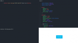
Today, I would like to show you that we can have a tool-tip effect using just CSS, please see the sample output shown below:

In addition to this, I would like to set your expectation, that I will be using SCSS for us to save time on getting this task done. For more details what is SCSS, you may check You do not have permission to view the full content of this post. Log in or register now.
Why am I using SCSS?
- I can declare variable and store CSS rules.
- Write a clear CSS rule with few lines needed.
With that said, please see our HTML elements below:
Here we have button element, with an attribute of hover-message. Easy to remember right? You should have this output shown below:

Before we continue, let us style our button element first, please see the SCSS rules below:
As you can see, I have declared these variables below:
Once completed, you should have this output below for your button element:

This time, let us pause and see how ::before and ::after works, for more details, you may open a new tab for You do not have permission to view the full content of this post. Log in or register now.
These are a pseudo element which allows you to insert content onto a page from CSS (without it needing to be in the HTML).
If you check these elements in your browser, via inspect element option, you should have:

You should have this output shown below:

If you inspect this element on your browser, you should have:

For starters, the "&::before" is a short-hand for "button::before". Just make sure it is a child rule of button element:
On the other hand, I know the content:attr() is confusing if you have not encountered this before, however, this will simply place a content is side the ::before from the attribute name "hover-message"
If you wish to dig deeper, please see You do not have permission to view the full content of this post. Log in or register now.
At this point, it may be knowledge overload for the starters, however, you may bookmark this post and check this later on instead.
If you are ready, let us proceed with adding the triangle below the "Hello World!"
You should have this output below:


Wow magic! All in all, you should have these CSS rules below:
For us to avoid repetitive rules for:
Let us correct this out, by:
This should work for both ::before and ::after . You should have this rules below:
Finally, let us show the Hello World on hover state, but first, set opacity: 0; for both ::before and ::after by
Then, shown both ::before and ::after during the hover state by
Overall, you should have this rules below:
I hope this will help you in some ways. If you wish to see these in action, please see You do not have permission to view the full content of this post. Log in or register now.


In addition to this, I would like to set your expectation, that I will be using SCSS for us to save time on getting this task done. For more details what is SCSS, you may check You do not have permission to view the full content of this post. Log in or register now.
Why am I using SCSS?
- I can declare variable and store CSS rules.
- Write a clear CSS rule with few lines needed.
With that said, please see our HTML elements below:
HTML:
<button hover-message="Hello World!">Hover me!</button>Here we have button element, with an attribute of hover-message. Easy to remember right? You should have this output shown below:

Before we continue, let us style our button element first, please see the SCSS rules below:
Code:
$color-button: #04bcef;
$color-tooltip: #04ef89;
$color-fonts: #fff;

body{
  padding: 0;
  margin: 6em;
  color: $color-fonts;
  text-align: center;
}

button{
  padding: 1rem;
  margin: 1rem;
  background-color: $color-button;
  border: none;
  color: inherit;
  position: relative;
}
As you can see, I have declared these variables below:
Code:
$color-button: #04bcef;
$color-tooltip: #04ef89;
$color-fonts: #fff;
Once completed, you should have this output below for your button element:

This time, let us pause and see how ::before and ::after works, for more details, you may open a new tab for You do not have permission to view the full content of this post. Log in or register now.
These are a pseudo element which allows you to insert content onto a page from CSS (without it needing to be in the HTML).
If you check these elements in your browser, via inspect element option, you should have:

Code:
$color-button: #04bcef;
$color-tooltip: #04ef89;
$color-fonts: #fff;

body{
  padding: 0;
  margin: 6em;
  color: $color-fonts;
  text-align: center;
}

button{
  padding: 1rem;
  margin: 1rem;
  background-color: $color-button;
  border: none;
  color: inherit;
  position: relative;

&::before{
    position: absolute;
    top: 0;
    left: 0;
    transition: all 0.2s;

    content: attr(hover-message);
    margin-top: -2.4rem;
    margin-left: -1rem;
    background-color: $color-tooltip;
    padding: 0.5rem 1rem;
    width: 110%;
  }
}
You should have this output shown below:

If you inspect this element on your browser, you should have:

For starters, the "&::before" is a short-hand for "button::before". Just make sure it is a child rule of button element:
Code:
button{
&::before{
  }
}
On the other hand, I know the content:attr() is confusing if you have not encountered this before, however, this will simply place a content is side the ::before from the attribute name "hover-message"
Code:
content: attr(hover-message);If you wish to dig deeper, please see You do not have permission to view the full content of this post. Log in or register now.
At this point, it may be knowledge overload for the starters, however, you may bookmark this post and check this later on instead.
If you are ready, let us proceed with adding the triangle below the "Hello World!"
Code:
&::after {
   position: absolute;
   top: 0;
   left: 0;
   transition: all 0.2s;

    border-top: 5px solid $color-tooltip;
    border-right: 5px solid transparent;
    border-left: 5px solid transparent;
    content: " ";
    margin-top: -0.5rem;
  }
You should have this output below:


Wow magic! All in all, you should have these CSS rules below:
Code:
$color-button: #04bcef;
$color-tooltip: #04ef89;
$color-fonts: #fff;

body{
  padding: 0;
  margin: 6em;
  color: $color-fonts;
  text-align: center;
}

button{
  padding: 1rem;
  margin: 1rem;
  background-color: $color-button;
  border: none;
  color: inherit;
  position: relative;

  &::before{
    position: absolute;
    top: 0;
    left: 0;
    transition: all 0.2s;

    content: attr(hover-message);
    margin-top: -2.4rem;
    margin-left: -1rem;
    background-color: $color-tooltip;
    padding: 0.5rem 1rem;
    width: 110%;
  }
  &::after {
    position: absolute;
    top: 0;
    left: 0;
    transition: all 0.2s;

    border-top: 5px solid $color-tooltip;
    border-right: 5px solid transparent;
    border-left: 5px solid transparent;
    content: " ";
    margin-top: -0.5rem;
  }
}
For us to avoid repetitive rules for:
Code:
    position: absolute;
    top: 0;
    left: 0;
    transition: all 0.2s;
Let us correct this out, by:
Code:
  &::before,
  &::after{
   position: absolute;
   top: 0;
   left: 0;
   transition: all 0.2s;
  }
This should work for both ::before and ::after . You should have this rules below:
Code:
$color-button: #04bcef;
$color-tooltip: #04ef89;
$color-fonts: #fff;

body{
  padding: 0;
  margin: 6em;
  color: $color-fonts;
  text-align: center;
}

button{
  padding: 1rem;
  margin: 1rem;
  background-color: $color-button;
  border: none;
  color: inherit;
  position: relative;

  &::before,
  &::after{
    position: absolute;
    top: 0;
    left: 0;
    transition: all 0.2s;
  }
  &::before{
    content: attr(hover-message);
    margin-top: -2.4rem;
    margin-left: -1rem;
    background-color: $color-tooltip;
    padding: 0.5rem 1rem;
    width: 110%;
  }
  &::after {
    border-top: 5px solid $color-tooltip;
    border-right: 5px solid transparent;
    border-left: 5px solid transparent;
    content: " ";
    margin-top: -0.5rem;
  }
}
Finally, let us show the Hello World on hover state, but first, set opacity: 0; for both ::before and ::after by
Code:
&::before,
&::after{
    position: absolute;
    top: 0;
    left: 0;
    transition: all 0.2s;
    opacity: 0;
  }
Then, shown both ::before and ::after during the hover state by
Code:
&:hover:before,
&:hover:after{
  opacity: 1;
}
Overall, you should have this rules below:
Code:
$color-button: #04bcef;
$color-tooltip: #04ef89;
$color-fonts: #fff;

body{
  padding: 0;
  margin: 6em;
  color: $color-fonts;
  text-align: center;
}

button{
  padding: 1rem;
  margin: 1rem;
  background-color: $color-button;
  border: none;
  color: inherit;
  position: relative;

  &::before,
  &::after{
    position: absolute;
    top: 0;
    left: 0;
    transition: all 0.2s;
    opacity: 0;
  }
  &::before{
    content: attr(hover-message);
    margin-top: -2.4rem;
    margin-left: -1rem;
    background-color: $color-tooltip;
    padding: 0.5rem 1rem;
    width: 110%;
  }
  &::after {
    border-top: 5px solid $color-tooltip;
    border-right: 5px solid transparent;
    border-left: 5px solid transparent;
    content: " ";
    margin-top: -0.5rem;
  }
  &:hover:before,
  &:hover:after{
    opacity: 1;
  }
}
I hope this will help you in some ways. If you wish to see these in action, please see You do not have permission to view the full content of this post. Log in or register now.

Attachments
-
You do not have permission to view the full content of this post. Log in or register now.