Let us create a basic navigation with just simple understanding on how to use display: flex;
Here is the markup:
Here is our CSS rules.
Display flex has been applied to nav element, and all the child element inside the nav, which are the a tags, will be displayed horizontally by default, then apply:
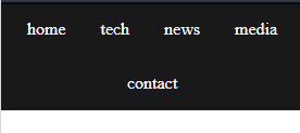
which gives you this layout shown below:

Let us get the spacing done by adding the margin rules to a tag:

If you wish to get the wrapping issue for nav element, see:

Just add this rule below:

If you wish to see this in action, please see:
You do not have permission to view the full content of this post. Log in or register now.

Here is the markup:
HTML:
<nav>
      <a href="#">home</a>
      <a href="#">tech</a>
      <a href="#">news</a>
      <a href="#">media</a>
      <a href="#">contact</a>
</nav>
Here is our CSS rules.
Code:
body{
      padding: 0;
      margin: 0;
}

nav{
      background-color: rgba(0,0,0,0.9);
      color: #fff;
      padding: 0;
      margin: 0;
      display: flex;
      flex-wrap: wrap;
      justify-content:center;

      a{
            color: inherit;
            display: inline-block;
            margin: 1rem;
            text-decoration: none;
      }
}
Display flex has been applied to nav element, and all the child element inside the nav, which are the a tags, will be displayed horizontally by default, then apply:
Code:
justify-content:center;which gives you this layout shown below:

Let us get the spacing done by adding the margin rules to a tag:
Code:
margin: 1rem;
If you wish to get the wrapping issue for nav element, see:

Just add this rule below:
Code:
flex-wrap: wrap;
If you wish to see this in action, please see:
You do not have permission to view the full content of this post. Log in or register now.

Attachments
-
You do not have permission to view the full content of this post. Log in or register now.