What's new

Closed Using Dreamweaver and Photoshop

Status
Not open for further replies.
Joined
Dec 9, 2014
Posts
32
Reaction
0
Points
69
Age
38
Using Dreamweaver and Photoshop

  1. ModifyArchive.zipcolor schemes to look likepof.
  1. Change logo of Archive.zip to the logo of pof.
  1. After modification, save work into lp11.
  1. Translate using google translate lp11 into Spanish.


  2. CAN ANYONE HELP ME DO THIS!!!
 
Try to read this.. it can help you a lilbit
  • You do not have permission to view the full content of this post. Log in or register now.
  • You do not have permission to view the full content of this post. Log in or register now.
  • You do not have permission to view the full content of this post. Log in or register now.
  • You do not have permission to view the full content of this post. Log in or register now.
  • You do not have permission to view the full content of this post. Log in or register now.
  • You do not have permission to view the full content of this post. Log in or register now.
  • You do not have permission to view the full content of this post. Log in or register now.
  • You do not have permission to view the full content of this post. Log in or register now.
    Insert an image
    You do not have permission to view the full content of this post. Log in or register now..

    You do not have permission to view the full content of this post. Log in or register now..
    1. Place the insertion point where you want the image to appear in the Document window and do one of the following:
      • In the Common category of the Insert panel, click the Images icon icon_image.png.
      • In the Common category of the Insert panel, click the Images button and select the Image icon. With the Image icon displayed in the Insert panel, you can drag the icon to the Document window (or to the Code view window if you are working in the code).
      • Select Insert > Image.
      • Drag an image from the Assets panel (Window > Assets) to the desired location in the Document window; then skip to step 3.
      • Drag an image from the Files panel to the desired location in the Document window; then skip to step 3.
      • Drag an image from the desktop to the desired location in the Document window; then skip to step 3.
      • In Live View, drag an image from the Extract panel or the Layers tab and drop the element at the top, bottom, right or left of an element based on Live Guides (as explained in the following image), or drop the element at a precise place in the document structure by clicking </> and using Element Quick View.
      PI-Extract.gif
    2. In the dialog box that appears, do one of the following:
      • Select File System to choose an image file.
      • Select Data Source to choose a dynamic image source.
      • Click the Sites And Servers button to choose an image file in a remote folder of one of your Dreamweaver sites.
    3. Browse to select the image or content source you want to insert.
      If you are working in an unsaved document, Dreamweaver generates a file:// reference to the image file. When you save the document anywhere in the site, Dreamweaver converts the reference to a document-relative path.

      Note:

      When inserting images it’s also possible to use an absolute path to an image that resides on a remote server (i.e., an image that is not available on the local hard drive). If you experience performance problems while working, however, you might want to disable viewing the image in Design view by deselecting Commands > Display External Files.


    4. Click OK.
    You do not have permission to view the full content of this post. Log in or register now..


    You do not have permission to view the full content of this post. Log in or register now..
  • Edit the Alt value in the Property inspector.

You do not have permission to view the full content of this post. Log in or register now.
Visually resize an image
You do not have permission to view the full content of this post. Log in or register now.
Insert an image placeholder
You do not have permission to view the full content of this post. Log in or register now.
Replace an image placeholder
You do not have permission to view the full content of this post. Log in or register now.
Set image placeholder properties
You do not have permission to view the full content of this post. Log in or register now.
Edit images in Dreamweaver
You do not have permission to view the full content of this post. Log in or register now.
Create a rollover image
You do not have permission to view the full content of this post. Log in or register now.
Use an external image editor
You do not have permission to view the full content of this post. Log in or register now.
Apply behaviors to images
You can apply any available behavior to an image or image hotspot. When you apply a behavior to a hotspot, Dreamweaver inserts the HTML source code into the area tag. Three behaviors apply specifically to images: Preload Images, Swap Image, and Swap Image Restore.

Preload Images


Loads images that do not appear on the page right away (such as those that will be swapped in with behaviors, AP elements, or JavaScript) into the browser cache. This prevents delays caused by downloading when it is time for the images to appear.


Swap Image


Swaps one image for another by changing the SRC attribute of the img tag. Use this action to create button rollovers and other image effects (including swapping more than one image at a time).


Swap Image Restore


Restores the last set of swapped images to their previous source files. This action is automatically added whenever you attach the Swap Image action to an object by default; you should never need to select it manually.

You can also use behaviors to create more sophisticated navigation systems, such as jump menus.
 

Attachments

Making Accurate Color Adjustments in Photoshop


You do not have permission to view the full content of this post. Log in or register now.
Discuss this in You do not have permission to view the full content of this post. Log in or register now.

It’s difficult to read numbers in the Info palette while you are pushing curves or dragging sliders because moving the Eyedropper tool makes numbers disappear. Instead of wasting time going back and forth with the Eyedropper to get color readouts, ensure your color adjustments are accurate with the Color Sampler tool.

When a client asked me to replace the classic red of a tricycle with their corporate color, I started by creating a chip of the desired color next to the bike. I’ve reproduced the image with the corporate color chip for you. To follow along, download the 3 MB You do not have permission to view the full content of this post. Log in or register now. and extract the tricycle.psd file, shown at left.
1.jpg
Open tricycle.psd and follow my process by selecting the Color Sampler tool. (Press Shift-I until it appears in the toolbox.) Click once in the color chip to place a color sampler point—a crosshair and a number. Press Command/Ctrl while click-dragging a sampler point to move it around. If you make a mistake, Option/Alt-click the sampler to remove it. Now click in the flat, colored area at the back of the tricycle seat for a second color sampler point. (You can place up to four points in an image.) Placing a color sampler point automatically expands the Info palette, and you’ll see readouts corresponding to your two points. Notice the readouts are in CMYK, but by clicking an eyedropper to the left of a readout, you can change it to RGB, Grayscale, or another option such as Total Ink. Control/Right-click on a color sampler point to access a contextual menu with some additional options.
2a.jpg
2b.jpg
I’ve already created a selection of the tricycle’s red areas for you, so select the Target chip layer, move to the Paths palette, and Command/Ctrl-click the Red Regions path to load it as a selection. Create a Hue/Saturation adjustment layer by clicking the Create new fill or adjustment layer icon at the bottom of the Layers palette. In the resulting dialog box, you’ll notice that as you drag the Hue/Saturation sliders, the Sampler 1 readout numbers do not change. The Sampler 2 readout displays two sets of numbers: The original values and the adjusted values. Your job is to bring the values for Sampler 2 closer to Sampler 1. Start by dragging Hue all the way to the right, decrease Saturation to –60, and click OK.
3a.jpg

3b.jpg


3c.jpg


cyan.jpg

magenta.jpg

yellow.jpg

black.jpg

Duplicate the Hue/Saturation adjustment layer by pressing Command/Ctrl-J. Now choose Layer > Change Layer Content > Curves. Press Command/Ctrl-1 to access the Cyan channel. Reduce the amount of ink by dragging the curve down about 3/4 of the way across the grid until the Cyan value of Sampler 2 in the Info palette matches the Cyan value of Sampler 1. Access the Magneta channel by pressing Command/Ctrl-2, but this time push up the curve until you match the Magenta value of Sampler 2 with the Magenta value of Sampler 1. After pressing Command/Ctrl-3 to access the Yellow channel, drag the curve down slightly to match the Yellow value of Sampler 2 with the Yellow value of Sampler 1. The tricycle now matches the target color, but it appears flat. To create the wider range of values evident with metallic paint, add a bit of contrast to the image in the form of another adjustment layer or a slight S-curve on the Black plate of the Curves adjustment layer.

Make a habit of arranging the order of your readouts the same way each time. For example, I make Sampler 1 the target color and Sampler 2 the color to be adjusted. When necessary, I use Sampler 3 to evaluate light areas and Sampler 4 for dark areas.

In the absence of a calibrated monitor and a color management system, matching color to a predefined color chip is remarkably accurate. In CMYK, the numbers don’t lie. If you have to match a given color, find the number of a PMS color that matches it, and place a chip of that color in the document. Use the color correction tools to modify the document’s color until it matches with the color chip.

rightarrow.gif
Don't miss the next Photoshop tip on Graphics.com. Get the free Graphics.com newsletter in your mailbox each week. You do not have permission to view the full content of this post. Log in or register now. to subscribe.
 
Photoshop Logo Tutorial: Step-by-Step Tutorial to Create a Business Logo with Photoshop

photoshoplogo-300x282.pngWhat’s the first thing you think of when you hear the word ‘Coca-Cola’? A polar bear? A glass of delicious bubbling beverage? Or maybe, those famous swirly white letters against a red background?

Try the same for Google. What do you see? The Google homepage with its blue and yellow and red colors, of course!

That’s the power of logos. Even though Google makes a ton of products, you don’t think of vast data centers and offices filled with programmers when you think of Google. No, you think of Google the brand with its slightly eccentric and nerdy logo. Same goes for Coca-Cola. Even though Coca-Cola actually sells a beverage you drink almost every day, your first thought when was of the company’s logo.

Designing logos is an exercise in narration. A great logo tells a story – what is the brand? What is it about? What are its ideals – in as few brush strokes as possible. Google’s nonchalant disregard for conventional logo designs (the logo was häçked together by Sergey and Larry and has remained the same for 15 years) immediately tells you that this company is different. It doesn’t care about the status quo. The Coca-Cola logo, on the other hand, has remained unchanged for over a century. It’s an instrument of nostalgia that gently reassures you – whatever else might change, your favorite beverage is going to remain the same, no matter what.

Designing a logo is the first step in building a business. You can learn more about designing logos in this comprehensive You do not have permission to view the full content of this post. Log in or register now..

In this blog post, we will learn how to design a simple logo for the world’s favorite fictional company, Acme Corporation.

What We Will Make
D5E84gRX0ZfLPAkVZ0lidr5lO1-dmv-gSjJrJkGML5lxKxRzn449vFQeXocbh9Hai2PHgG_QBA1gaiWNphs2XYM-bh0N8shek5N87XLRXtPAAC3oqD_4PJbBj8HF7DtIdqk


We will use Adobe Photoshop CS6 for this tutorial, though you’ll be perfectly fine with older versions of Photoshop as well.

Want to use Adobe Illustrator? Learn You do not have permission to view the full content of this post. Log in or register now.in this course.

Step 1: Create a New Document
Go to File -> New, or press CTRL+N in Photoshop. Select the appropriate width and height for your design. I like to have a large enough canvas to work with – around 1000px width and 600px height. You can always change canvas size later.
bOIQ5ckwiW5yeiFxcPrAXu7fBiaPL63wvPM5W8yRLrjpUPTjOph0v4lZ0TudN83-_ZtXjPhqg8_VN7AOgjDQmFUKyzbK7Apq14d3BtUdHXo3ueC-KI4lh5EDVm4xtRKi5Tg


Step 2: Create the Basic Shape
To create the effect that we want, we will make our ‘A’ with two overlapping shapes as shown below:
RASzJ_N99hMB74zktoG-PlRJl5TWSUBcd_FkmA1cqBDKyFpLUUYFzzCo2BhTL0ySR6-ny8VhlMJDuLzZ1vJM6Xav7uH4qxjlsyJ6QjvY3n_K3wV3Js1L6LzywBaxbw5iBSQ


We’re going to use the ‘Pen’ tool to create our shapes. It’s the pen shaped icon on the toolbox to the left.

wAXCreufk9Osydz11Eo3fS1d6Az87ZAl7qQw4GcPaPO1ctuJFhPQZbZExjoq6i_3a7xC0KBLFBBFJxXSFNRNs-UG9yb5vmx6qVPhb55EildNQUp35IijvbWKqRWV56Tl2NU


Now create a new layer. Name it Shape 1. Select the pen tool, select ‘shape’ in the tool properties at the top. Choose a bright red color for the fill (I used #ed1c24).

m9VKvqjBGde_Bu6-GHZVsSh0XpKHFqGDvxKQmW4CcMpiSYFTiIQcShws63t96bfMRAGSo-JX7C5zGQfQseJh1ZVAuQrhRDa_EBTCHUfs9ZK-J29fzkvUTSACTrdBVpRyBj4


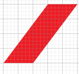
It’s useful to switch on the grid while drawing. Go to View -> Show -> Grid, or press CTRL + ‘. Create the shape as shown below:
OEXZsEOF0Ooajb5q_IwyoCzMVt94M_pG6sWpUF9AjCJyCDBOFdOwKTeRSFSY5aNgqI5B6P9l-tX5LUhtMnl-gHmnpp4z5TNJw1tpmeQIaKn6RAZ2T5Ia57PsKPPrd1fWBF8


For the second shape, instead of drawing it from scratch, we can simply duplicate the Shape 1 layer and flip it horizontally.

Select the current shape in the layers window on the right. Right click on it and select ‘Duplicate Layer’. Name the new layer Shape 2 you want.
wLFG_ZvLuyf-mudeugZAjLqr7LxqEBbeYQ2zjMQDaBW-1a7pU9hYJB3nQ3j71JdCoeP-3LNeQB_o1CZXpToWGtY9WURIG8wIVfiTxD2Nrk6nQPOoSqi2CbUnunJbPs2CirM


Now select the duplicate layer, go to Edit -> Transform Path -> Flip Horizontal

You should have the following shape now:

9R4T7_9oE4mGOB3ZUrUbOhWV3jlft_Pr2AIuI56oVje77oG5U54HYmwfg9GIEIH1L7sQNCHk-D4xX4VGdoC66FIk40OYtWcWjaHhp_DKN4AhpuLpCDdquRAswQQjUnrXD8Q


Drag it over to the right so that it overlaps the first shape perfectly as shown in the images above.

Learn You do not have permission to view the full content of this post. Log in or register now. in this course.

Step 3: Change Colors
Since we want to create an overlapping ‘Origami’ like effect, we will make one of our shape layers slightly darker in color to give the impression of depth.

Double-click on the Shape 2 thumbnail in the Layers window. The color selection pane should pop-up.
zBhDehGPoHr9Tlod2pt-Wyh-042z750VepkSpol9rsFgQHVJkEd9aN4-xjehmv4nXkZwkkCeYCxzJiwveEwvpKYNH6N7DxKb-NrCaZ8hy5pClJztP3tppt9ne3NuG-oNyx8


Select a slightly darker shade of red. I choose #b00309

While you’re at it, drag the Shape 1 layer on top of the Shape 2 layer in the Layers window as well, such that Shape 2 appears to be behind Shape 1.

Step 4: Creating the Shadow
Duplicate the Shape 1 layer as described above. Name it Shadow Layer Change the color of this new layer to black (#000000). Go to Filter -> Blur -> Gaussian Blur. Choose a radius of 2.75 pixels. Your image should look like this now:
Ok-NOGcP5iBeSZ6oVY59b5uJfzNwx6ycSbURMZyty2FyA6QC5uogUj9ZF8R1686JrJ23pTMlfrint51OXIS8QVPKDWWWSwte-IrPnZfRgiPh4TydlJQHSZT1gnBgdumK33g


Now drag the Shadow Layer underneath Shape 1 in the Layers window. Right click on Shadow Layer and select ‘Create Clipping Mask’
KJn-WOSTLwElTF1CAKNvA5h8RoVs8di2k7SZmNKDgg-w7oomudosjsqyMfg0U2Ohv4H0juVtmVR136b6Cp5njlVW6l2qxgz4zxaEV2fLpe9E6wXoo22ZAj-0LYailOzZ4Ds


Your image logo should now have the nice shadow effect.
kghqkuqYjq_Cj4NYUcwEJKhFX_IN65DPFEWyY37GsjbGNWg_jgyjOLd8GI1t9U3f5skbcFxOsrTt1hLZT4PebjTfs8ISZvJaEMFimU3ECK1afbMA3pC0PqoJeMjBsNIzdfA


Step 5: Add the Text
We’ll now add text to our logo. Unfortunately, the default Windows font selection isn’t exactly too great. So instead of using tired, stale fonts like Arial, we’ll head over to You do not have permission to view the full content of this post. Log in or register now. and download a bunch of new, modern fonts.

For this project, I recommend downloading You do not have permission to view the full content of this post. Log in or register now.. This is just a personal preference though. You can choose any one of the hundreds of free fonts on Google Fonts. Some of my personal favorites are:

  • Open Sans
  • Roboto
  • Ubuntu
  • Exo
  • Lobster
  • Bevan
Once you’ve installed the Raleway font (extract the downloaded .zip file and double-click on the font-name to install automatically), head over to the ‘Type’ tool in the toolbox and add your text.

I choose Raleway with font-weight of ‘bold’ and a font-size of 200px. Feel free to experiment with this if you want.

Place the text below the logo. For a bit of extra effect, add a drop shadow to the text. Right click on the text layer, select ‘Blending Options’. In the window that pops up, choose ‘Drop Shadow’ and pick the following parameters:
1WZZh8jJNNwGPZwngV0lHMMCU8ArBWZ5Y4Z2NDDCEuocBu4PJpdz1uBJ2Acr5UgEw0zB0fgMa5ZcJ4VAPQB_mJEbEqeZ_1D7lEmHkwkST9vw_nUs7BF85qSSIIwNi5h6cb0
wcp0LP4FZdZoRbDqneQf86V4Dls1X0KkHHdzIOj5gGne7sz6nV-hcKu5cP1wJ8jkL-HJmpuRMqnp9edue70WfybFgLkvOb-Z4O5o94Kf7zSOHVjz1g3xjjVeX4nR0hcZhGU


Step 6: Add a Background Gradient
This is the final step to give our logo a bit of dramatic flair.

Click the ‘Create New Fill or Adjustment Layer’ button at the bottom of the Layers Window.

ONSUNMgbzEaEexgdD8Yqjg5jxvw0KXuXuyf4egW32dBulaTy2jfj2Tqrr6LgHcrOq16GxpU9SLYjP154pKrh-qLkEN66PhQvB8mm_Po_KwbFSNGu_KBiJNPp7JJgZ9QS8Ho


Choose ‘Gradient’. In the window that pops up, select ‘Radial’ under Style. Make sure to check the ‘Reverse’ option at the bottom.
kA_vQRGKvlMM5l-oQ162tYuF9djifyCaujcivuv67s-0MQlCsWjoDOq3deKTt_iZ3kF3BRR_mCROvjupfYI6NgCtrFNiD8i3Y1VD1Cd77LW7XeYdwDrK8j0mdktVMUkF7Xw


Now, double click on the gradient color in the window. The gradient edit window will pop up. Play around with the colors and settings for a while until you find something you like.

euW5NBGWdG-A2CqX5YzVo32-vMPogTICwAxIFoEllPfMb4-2JE1Z8ZRkFi6uqCCyfmddlH_CBwiYkLKd-cK38142AMJ-dbMqe5E2_7__ABS-liyR4HVwbS4ZEO8mHB_w4y4


As a final step, drag your gradient layer below all the other layers in the Layers window, which should look like this:
GHJ90fCbv6WT5F0nAcg-y6e1_7UeAcHPzWszklb1pH7m8qt67rePhONgMkZncMV_dh1N_p2VeVGSlzfvh8vLX1wdBUJMvNBU7MRV41QoIhvNd_6lw-5afooBo1bQ4JdG_WY


Your logo is now complete!
 

Attachments

Introduction
Video: Saving Images

In Photoshop, saving works a bit differently from most other applications. Instead of working with one main file type—such as .docx in Microsoft Word—Photoshop offers a variety of ways to save your images. In this lesson, we'll talk about the different saving options in Photoshop, along with some common reasons to save files in different formats.

If you'd like to follow along, you can download our You do not have permission to view the full content of this post. Log in or register now..

Saving options
When you save a file in Photoshop, you'll have many different saving options and file formats to choose from:

  • PSD: This is the default file type for Photoshop documents, although you won't necessarily use it for every image. It will save your layers and all of the other information in your image so you can easily re-edit it later. PSD files are designed to be opened in Photoshop, so if you want to share the image with others you'll also need to save a copy of the image in a common file format, such as JPEG.
  • Common file formats: You can save images in a variety of common file types, such as JPEG and PNG. These file formats can be viewed and edited on almost any computer or mobile device, which makes them well-suited for sharing with others. However, unlike PSD files these formats aren't as useful if you plan to continue editing the file, and they also can't preserve layer information.
  • Save for Web: If you're planning to upload an image to the Web—like on a blog or website—you'll want to use the Save for Web feature. This tool allows you to save images that are optimized for the Web, which will make them easier to download and view online. Save for Web also includes several helpful features for preparing images for the Web, such as the option to resize images.
In the image below, you can see three different versions of an image file: the original JPEG file, an edited PSD version, and a final JPEG version that's been resized and saved for Web. You can see that the Web version has a much smaller file size than the original or PSD versions:

save_intro_folder_sorted.png

Ultimately, the saving option you choose will depend on what you need to do with the image. Let's take a look at a couple of different scenarios to see why you might choose different saving options.

Scenario 1
Let's suppose you're asked to create a new header image for a company website. You've been given a photo to include, and you need to add some text with the company name. Because you'll likely edit and revise this type of project, you'll want to save it as aPSD file. This way, you can easily continue editing the file later on. And because it will eventually be posted online, you'll also want to use Save for Web to create a new JPEG version of the finished image.

Scenario 2
Let’s say you're planning to share some photos from a recent vacation with your friends. You'd just like to make some quick adjustments in Photoshop—such as cropping and rotating—before sharing them. In this case, you could open the original image files in Photoshop, make the necessary adjustments, then save a new version of the edited photos as JPEGs. Because none of these edits are too complicated, you probably don’t need to save a separate PSD version of each image.

As you can see, the saving option you choose will vary from project to project. Before you save an image, take a moment toconsider what type of files you'll need. As you start to gain more experience with Photoshop, this process will begin to feel quick and natural.


Page 2

Using Save As
You'll use the Save As command to save files in the PSD format, as well as other common formats like JPEG and PNG.

To save a file with Save As:
  1. With the image open in Photoshop, select File
    lesson_action.gif
    Save As.
    save_as_command.png
  2. A dialog box will appear. Type the desired file name, then choose a location for the file. You'll want to use a new file name to avoid accidentally overwriting the original file.
    save_as_folder_sorted.png
  3. Click the Format menu and choose the desired file format. In our example, we'll save this image as a JPEG file. If you're saving as a PSD file, make sure the Layers option is checked. However, most other formats won't allow you to select this option.
    save_as_folder_format.png
  4. Click Save.
  5. Some file formats, such as JPEG and TIFF, will give you additional options when saving. Select the desired quality level, then click OK to save the image.
    save_as_quality.png
If you've already saved your project as a PSD file, you can select File
lesson_action.gif
Save or press Ctrl+S (Command+S on a Mac) to save your progress at any time. However, if you're working with another format such as JPEG, we recommend usingSave As to avoid overwriting your original file.

Open the example file in Photoshop and then try saving in different file formats, such as PSD and JPEG. Notice how the PSD format preserves the individual layers, while the JPEG format does not.

Page 3

Using Save for Web
When you use the Save for Web feature, you'll need to make a few decisions about the image you're saving:

  • File format: Save for Web allows you to choose from a few Web-safe file formats. Most of the time, you'll use the JPEG format for photographs. PNG-24 will keep the full quality of the image, whereas PNG-8 is mainly used for graphics and illustrations that use just a few colors. Generally, you won't need to use the GIF or WBMP formats.
    save_web_intro_format.png
  • Image size: If desired, you can resize the image directly from the Save for Web dialog box. Resizing the image to be smaller will also reduce the file size. However, if you're using a service like Facebook or Tumblr, you probably won't need to resize your images because these services resize them automatically.
    save_web_intro_size.png
  • Quality: If you're using the JPEG format, the image can be saved at different quality levels. You may want to experiment with different settings to find the best balance between quality and file size.
    save_web_intro_quality.png
Drag the slider in the interactive below to adjust the jpeg compression quality. Remember, higher quality levels will also increase the file size. Try to find a setting that looks good while keeping the file size relatively small.


To save for the Web:
  1. Select File
    lesson_action.gif
    Save for Web.
    save_web_command.png
  2. The Save for Web dialog box will appear. Select the desired file type and quality level.
    save_web_format.jpg
  3. If needed, resize the image by typing the desired dimensions under Image Size. When you enter the new image width, the height should be adjusted automatically to maintain the original aspect ratio.
  4. If desired, you can use the 2-Up view to compare the original image with a preview of the new version. This is an easy way to make sure you haven't lost too much quality from the original version. Note the file size in the bottom-left corner of each preview window.
    save_web_2up.jpg
  5. Click Save. A new dialog box will appear. Type the desired file name and choose a location for the file, then click Save. You'll want to use a new file name to avoid accidentally overwriting the original file.
    save_web_done_folder.png
Open the example file in Photoshop and use Save for Web to save a new version of the image. Try out different file formats and quality settings to see how they affect the image's quality and file size.
 
Status
Not open for further replies.
Back
Top